Filed under: Copy, Web Design
What’s Your Website Saying About You When You’re Not In The Room?

You know that feeling when you walk into a store that looks beautiful, but … nothing’s labeled, you can’t find the fitting rooms, and there’s no one there to help you?
Yeah, me too. And no, I don’t stay and try to figure it out.
That’s what a design-only website feels like.
It’s pretty. The colors are perfectly harmonized. The layout is chef’s kiss. But you land on the homepage and you’re just … confused. You can’t figure out what they actually do, who it’s for, or what you’re supposed to do next.
The worst part? The business owner usually has ZERO clue this is happening. They think their website must be working because it looks professional, but in reality, it’s quietly turning away potential clients — every. single. day.
Your Website Has a Voice
Whether you realize it or not, your website is speaking for you 24/7. While you’re sleeping, grabbing coffee, in client meetings, or binge watching the Great British Baking Show, it’s out there in the internet-verse having full on convos with people who are interested in your business.
And what it’s saying?
That depends on your copy.
Design draws them in. Copy holds their interest and encourages them to buy.

Oh! By the way — I’m Mackenzie, founder of By Kenz Diamond. I help creative business owners find the words that build trust, sound human, and bring in the kind of clients they actually want to work with. After writing websites for brands across the wedding, lifestyle, and design industries, I’ve learned that great copy doesn’t just “sell.” It creates connection. It builds a brand voice people remember, and that’s the foundation of every website I write.
What Your Website Might Be Saying Behind Your Back
So let’s talk about what your website might be saying when you’re not in the room. Because chances are, it’s having conversations you didn’t approve.
“I’m confused about what I offer.”
This happens when your homepage is trying to say too many things at once. Or when your services are described in vague, industry jargon that sounds impressive but means nothing.
What it sounds like: “I do… things? Strategic things. Solutions. Experiences. You know, business stuff.” This is bad bad, friend. The last thing you want is for potential clients to think you don’t even understand the value of your offer.
The fix: Get specific. What’s the ONE thing you want people to understand about what you do within 3 seconds of landing on your site? Start there. Your headline should answer the question “What do you do and who do you do it for?” in one clear sentence.
“I’m just like everyone else.”
When your copy uses the same generic phrases as every other website in your industry, you blend into the background. “Helping you level up.” “Dedicated to your results.” “Passionate about helping you grow.” Cool. So is literally EVERYONE.
What it sounds like: “I wasn’t sure how to stand out, so I went with the same buzzwords everyone else uses.”
The fix: SHOW YOUR PERSONALITY, GURL! Use words you’d actually say out loud. For example, I would win an Olympic medal in how many times I actually use the word “actually” in real life. It’s a problem, but my writing wouldn’t sound like me if I didn’t include it.
Tell stories. Have opinions. The goal isn’t to appeal to everyone—it’s to make the RIGHT people feel like you get them. Be specific about your approach, your process, what makes you different. And for the love of all that’s good and great, STOP SAYING YOU’RE PASSIONATE. Show me instead.
“I care more about style than substance.”
This is the website that’s all aesthetics, without any real meaning. Beautiful imagery, minimal text, and a big fat zero on the clarity scale for what really happens when someone works with you.
What it sounds like: “I’m really into my vibe, but I’m not super concerned about whether you understand what I’m offering.”
The fix: Give people the information they need to make a decision. What do you offer? What does it cost (or at least a range)? What’s the process? What results can they expect? Pretty is great, but pretty AND clear is better. Your website should be helpful first, beautiful second.
“I don’t know who I’m talking to.”
This website is trying to be everything to everyone. The services section is a mile long because god forbid they turn anyone away. The messaging is so broad it could apply to literally any human with a credit card. And it’s super important to remember that it’s OKAY if your website turns some people away. THAT’S WHAT YOU WANT.
What it sounds like: “Are you a person? With a business? Or a problem? Or just… existing? Great, I can help!”
The fix: Get clear on who your ideal client actually is. Then write like you’re talking directly to them. Not to “businesses” or “entrepreneurs” or “people who need help.” To Sarah, the interior designer who’s booking clients but her website makes her look like she started yesterday. Be specific. It’s scary, but it freaking works!
How To Make Sure Your Website Copy Is Saying The Right Things
Okay here’s the big question: how do you make sure your website is having the conversations you want it to have? Here’s what needs to happen:
- Clear messaging hierarchy. Your homepage should guide people through a logical flow: Here’s what I do → Here’s who it’s for → Here’s why it matters → Here’s what to do next. Every page should have a purpose and lead somewhere.
- Conversational tone that fits your brand. Write like you talk. If you wouldn’t say it out loud to a client, don’t put it on your website. Your copy should sound like YOU—not like a dystopian robot or a motivational poster.
- Clear calls-to-action. Every page should tell people what to do next. And I’d LOVE if you did your best to say away from the usual buttons like “learn more” or “contact us.” I want you to give actual, specific next steps. “Book your free consult.” “Download the pricing guide.” “Take the quiz.” Make it stupid simple for people to say yes.
- Copy and design working together. Your designer isn’t just making things pretty—they’re creating visual hierarchy that guides people through your messaging. Your copywriter isn’t just filling in text boxes—they’re crafting the story your design is supporting. When these two things work in tandem? That’s when you’ll get the BEST results.
Copy x Design
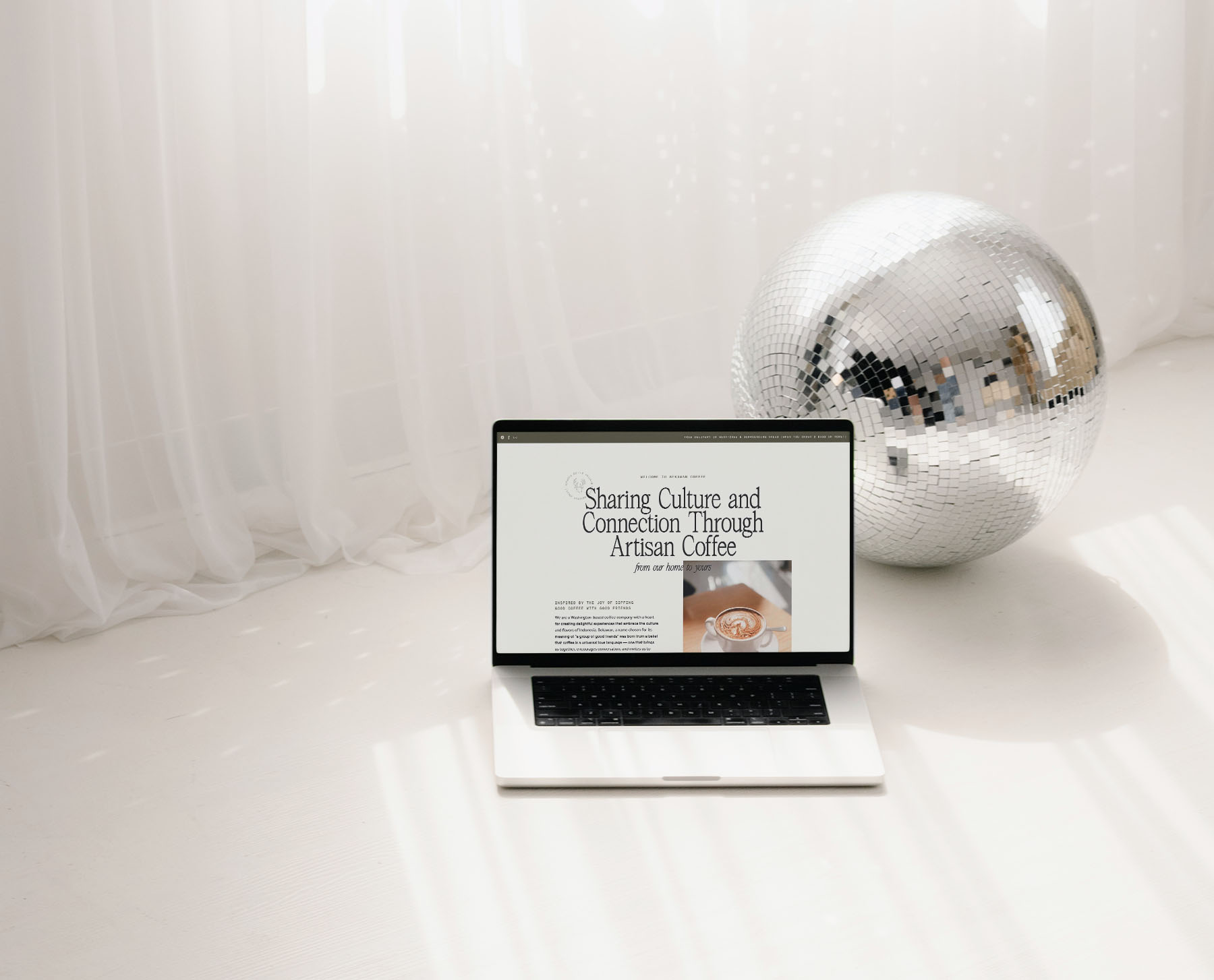
This is exactly why Chelsea and I LOVE to collaborate on website projects. Because when design and copy work together, your site doesn’t just look good, it sells for you. I have an exclusive VIP week copy package for Lennox Creative Co. clients, so if you’re interested in working together, reach out! We’d love to bring your stunning, STRATEGIC new website to life. If you want your website to start having the right conversations, here’s where to start.
Need Some More Copy Support?
Here are my best resources to help your website start having the right conversations with your readers:
Read the blog: My blog is THE go-to place for procrastinating productively. Head on over for more tips on writing website copy that converts, a behind-the-scenes look at the copy process, and all things messaging strategy. Find it here.
Get weekly copy tips in your inbox: Join my newsletter, The Byline, for stories, actionable copy advice, and features of recently published websites written by me!
Work with me: If you’re ready to stop DIY-ing your website copy and FINALLY feel good about what your website is saying when you’re not in the room, let’s chat about how we can work together. See all my services here.
Launching your Showit site just got 10x easier
You’ve got the template, now let’s actually get it live. The Ultimate Showit Setup Checklist walks you through everything from customizing your site to connecting your domain, so you can launch with confidence knowing nothing’s been missed.
You may unsubscribe at any time. Read the Privacy Policy for more information.


