

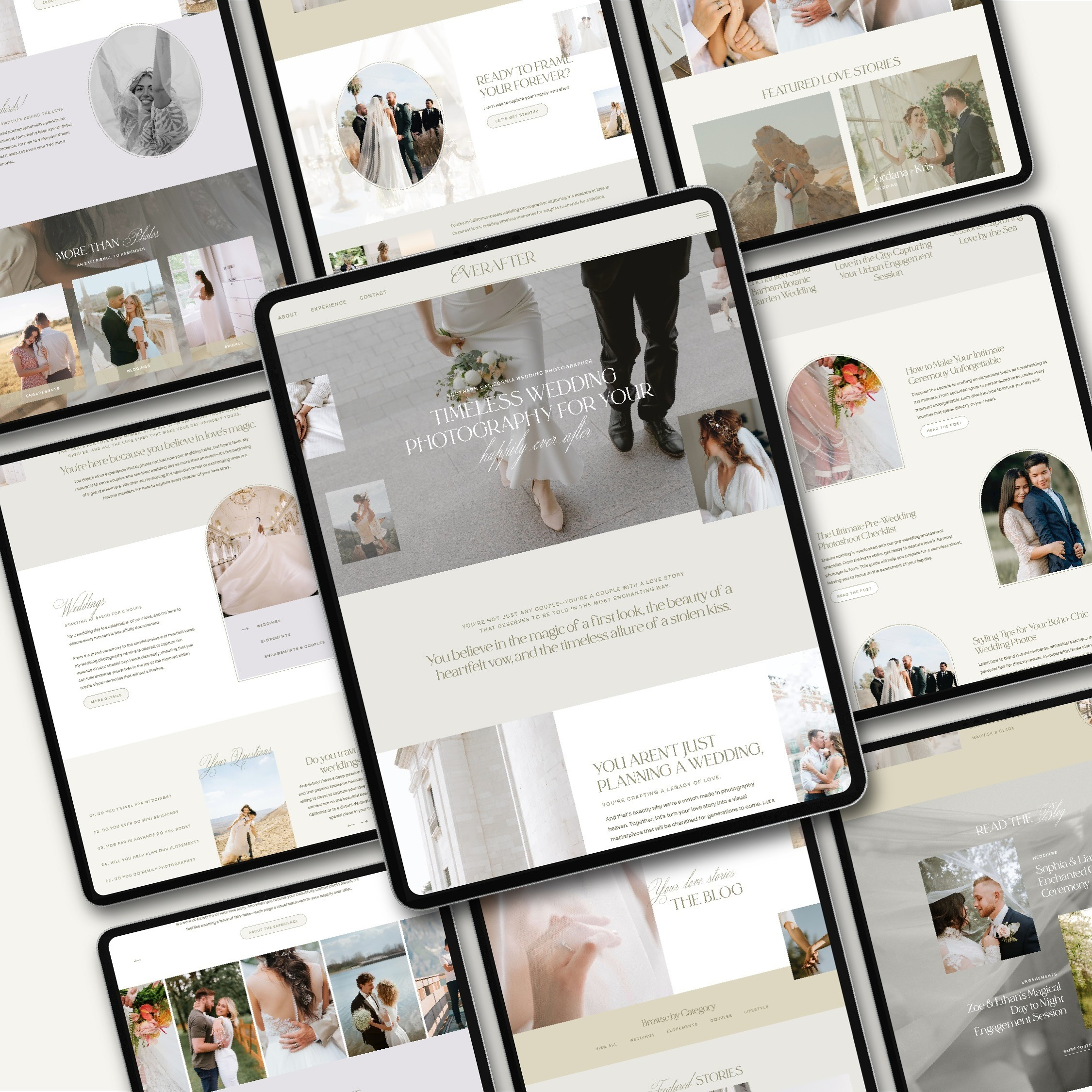
Customizing a Showit template is one of the easiest ways to create a beautiful, professional website without starting from scratch. But here’s the catch, just because it’s easier doesn’t mean it’s always straightforward. We’ve seen it time and time again: you dive into your template with big ideas, only to end up with a site that feels off, looks broken, or doesn’t convert.
If you’re customizing a Showit template right now (or about to), this post will help you sidestep the most common mistakes that can derail your design and confuse your visitors. We’re walking through five pitfalls we see often, and exactly how to avoid them.
If we haven’t met yet, I’m Chelsea. Showit Design Partner and founder of Lennox Creative Co. If you’re feeling stuck while customizing a Showit template, we’re here to help. Our Website in a Week service is perfect for creatives who want a custom-quality site without the overwhelm. We’ll handle the strategy, design, and launch, so you can stay focused on what you do best. Or, if you’re in a DIY season, our easy-to-customize Showit templates are built with strategy, style, and fully written example copy to help guide your voice and vision.
Ready to see what’s possible? Browse our portfolio, or reach out to chat about bringing your vision to life.

Inconsistent Branding & Visual Disruption
When customizing a Showit template, it’s tempting to jump straight into colors, fonts, and photos. But without a clear brand foundation, things can get messy fast. Even the most beautiful Showit template can look off-brand if you swap in elements without intention.
For example, replacing cohesive imagery with a mix of styles or choosing fonts that don’t reflect your brand personality can lead to visual confusion. And when your brand looks inconsistent, potential clients start to question your professionalism, often subconsciously.
Instead, start with brand strategy. What do you want your visuals to communicate? Choose colors, fonts, and imagery that align with that message and apply them consistently across the site. A good template should make this easy, but only if you’re clear on what you’re aiming for.
Need a little help getting your brand direction dialed in first? Read our guide to branding and color psychology, it’ll help you make confident visual choices from the start.
Layout Breaks & Mobile Responsiveness Issues
One of the biggest perks of customizing a Showit template is the drag-and-drop freedom. But with great freedom comes great potential for design chaos. It’s easy to accidentally stretch, move, or delete elements that were carefully placed by the original designer. Suddenly, sections feel off-balance or totally misaligned.
Even worse? What looks okay on desktop might be a mess on mobile. Since Showit gives you separate control over mobile and desktop views, any changes you make on one side won’t always translate to the other. If you’re not double-checking both, your mobile site can end up broken, or completely unreadable.
When customizing a Showit template, always preview your changes on both views. If you’re not super confident in your design skills, stick to the original structure where you can and only make layout edits when you’re confident in the design flow. Mobile matters more than ever (your dream clients are probably browsing on their phones), so make sure their first impression is flawless.
How Customizing a Showit Template Can Impact Your SEO Structure
Customizing a Showit template should never come at the cost of your website’s searchability. But it’s one of the easiest things to overlook, especially if SEO feels intimidating or overly technical.
Here’s what to watch for:
- Header tags (H1, H2, etc.): Showit automatically tags your title, heading, and subheading boxes as H1, H2, and H3. This makes structure easy, but it also means you need to double-check any new text you add.
- Swapping text for images: Your page might look better with everything in a graphic, but search engines can’t read text baked into an image. Always use actual text boxes for keywords and core messaging. And when you do use images? Don’t forget to add alt text!
- Ignoring title tags and meta descriptions: Showit gives you full control over this (which is a win), but it’s only helpful if you actually use it. Make sure each page has a unique title and description.
- Breaking page hierarchy: Don’t randomly add or delete pages without thinking about how they connect. Every page should have a purpose and a place in the overall structure.
In Showit, changing your page title will also change the URL of that page. That’s helpful for SEO when done intentionally, but it can also create broken links across your site if you forget to update your menus. Always double-check your main navigation, footer menu, and mobile menu after making title or URL changes.
When you’re editing, it’s easy to unknowingly break the structure that helps Google understand your site. That can mean fewer people finding you, no matter how stunning your site looks.
If you’re not sure where to start, this post on SEO mistakes photographers make breaks it down in plain language.

Navigation Confusion & Poor UX Flow
When customizing a Showit template, it’s easy to get caught up in the visual details and forget about the user experience. But if your visitors can’t figure out where to go, or how to get back, they’ll likely click away and never return.
A common mistake is overcomplicating your navigation. Maybe you added too many links, changed page names to something clever but unclear, or rearranged the order without thinking about the journey your visitor is on. When that happens, your site starts to feel more like a maze than a welcome mat.
Another issue? Pages that look great but lack clear calls-to-action. If people land on your homepage and aren’t guided toward your services, portfolio, or contact form, they’ll probably leave without taking the next step.
To avoid this, take a moment to step into your dream client’s shoes. What would they be looking for when they land on your site? How can you make it as easy as possible for them to find it? Stick to a simple, intuitive menu and make sure every page leads them somewhere purposeful.
Brand Messaging Getting Lost in the Design
A beautiful website means nothing if it doesn’t sound like you. One of the biggest mistakes we see when creatives are customizing a Showit template is putting all the focus on visuals and forgetting to carry their message through the copy.
When your design looks polished but your messaging is vague, confusing, or inconsistent, it creates a disconnect that turns potential clients away.
To keep your messaging front and center, take time to write copy that reflects your personality, values, and offers. Infuse your site with language that speaks directly to your audience. And make sure your most important messages are easy to find, especially on the homepage and services pages.
Prefer to DIY with a little creative head start? Shop our Showit templates, each one is easy to customize, strategically built, and totally scroll-stopping. Even better? They come with fully written-out example copy to give you a starting point and spark ideas in your own voice. Perfect for photographers and creatives who want a beautiful site without the blank page stress.
Customizing a Showit Template Without the Headaches
Customizing a Showit template should feel empowering, not overwhelming. But without the right strategy, it’s easy to fall into these common traps that water down your brand, confuse your visitors, or slow your growth.
The good news? You don’t have to do it all on your own. Whether you’re feeling stuck in your DIY process or ready to hand it off completely, we’re here to help. With our signature Website in a Week service, you can go from “forever under construction” to fully launched in just one week.
And if you’d prefer to DIY, don’t forget that our Showit templates are a solid place to begin. They’re SEO-friendly, built with strategy in mind, and packed with example copy to help spark your own words and make the writing part way less overwhelming.
Reach out to get started, or browse our portfolio to see how we’ve helped other creatives bring their vision to life. For more tips and behind-the-scenes inspiration, come hang out with us on Instagram.
Launching your Showit site just got 10x easier
You’ve got the template, now let’s actually get it live. The Ultimate Showit Setup Checklist walks you through everything from customizing your site to connecting your domain, so you can launch with confidence knowing nothing’s been missed.
You may unsubscribe at any time. Read the Privacy Policy for more information.


