
Have you ever wondered why some logos instantly grab your attention and make you feel a certain way? Or why certain product packaging entices you to pick it up from a crowded shelf? It’s by design, and a lot of it comes down to an important strategy known as color psychology!
As creative entrepreneurs in a kind of crowded space these days, we know that every detail matters when it comes to building a strong brand identity. And when it comes to branding, your brand’s color palette is more than just aesthetics – it becomes a visual representation of your essence, values, and the unique way you serve your clients. Just like a well-designed website, the strategic use of colors holds the potential to create powerful connections and leave a lasting impression on your target audience.
In this post, we’ll explore the nuances of color, it’s impact on human behavior, and how to leverage it in your own branding. Let’s dive in!
What is Color Psychology?
Remember those riveting lectures from your Psych 101 class in university? Well, color psychology is a bit like that, only way more “colorful” and exciting when it comes to branding! Color psychology is the study of how different colors influence human emotions, perceptions, and behaviors.
Color theory is where the practical magic happens. It’s all about mixing, pairing, and manipulating colors to create a captivating visual experience. It’s a blend of science and art, where you get to play with hues, shades, and tones, all in the name of telling stories and helping your dream client connect with your brand.
The Role of Color Psychology in Branding
Imagine a world without colors… pretty dull (quite literally, haha), right? Branding is no different! Colors have this amazing ability to communicate messages, trigger specific feelings, and even influence our purchasing decisions. Different colors have different psychological effects on people, which makes color selection a BIG, strategic decision for business owners + brand designers. According to this wild list of color psychology facts, color alone can influence up to 90% of an initial brand impression and 93% of shoppers focus on the visual appearance before buying from a brand.
Just think about how vibrant and playful brands like Google use a colorful palette to create an approachable and inclusive image. On the other hand, luxury brands like Chanel or Rolex use sleek and sophisticated colors, like black and gold, to exude a level of exclusivity that makes people want to own their products.
Color is also a powerful tool for creating visual differentiation in a crowded marketplace. The right color palette can make a brand instantly recognizable, memorable, and deeply ingrained in the hearts + minds of consumers.
Let’s dive into common colors and their meanings.
The Meanings + Effects of Colors
Blue
Associated with trust, reliability, and professionalism. The color blue has a calming effect and can promote a sense of security and stability.
Brand examples: Facebook, HP, PayPal
Red
Commands attention and evokes strong emotions. Brands leverage the power of red to create a sense of energy and enthusiasm around their offerings.
Brand examples: Coca-Cola, Netflix, Target
Yellow
Radiates positivity, happiness, and optimism. Using yellow creates a cheerful and inviting atmosphere that grabs attention.
Brand examples: McDonald’s, IKEA, Post-it
Green
Closely tied to nature, growth, and harmony. Green is known to symbolize freshness, health, and sustainability.
Brand examples: Starbucks, Whole Foods, HelloFresh
Purple
Associated with creativity, luxury, and spirituality. Brands that use purple evoke a sense of exclusivity and a hint of indulgence. Purple has also been considered the color of royalty dating way back to ancient times!
Brand examples: Purdys, Hallmark, Urban Decay
Pink
Associated with femininity, romance, and playfulness. Pink can create a sense of tenderness and charm, making it a popular choice for brands targeting a predominantly female audience.
Brand examples: Barbie, Victoria’s Secret, The Heartbreak Nurse
White
Symbolizes cleanliness, modernism, and simplicity. White is often used by brands to convey a sense of minimalism and timelessness.
Brand examples: Chanel, Adidas
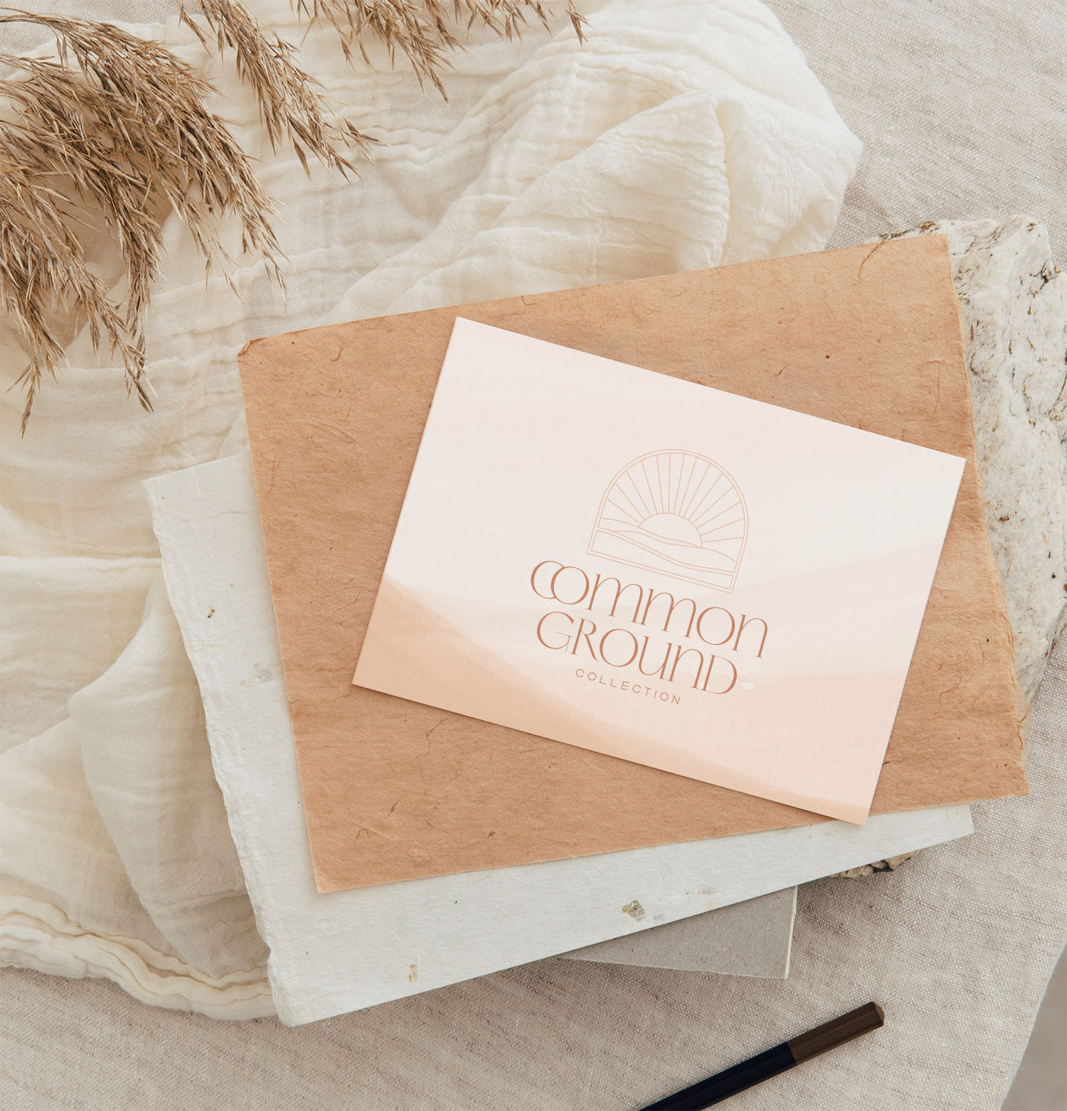
Orange
Radiates warmth, energy, and enthusiasm. Orange is a vibrant color that grabs attention and stimulates feelings of excitement and creativity.
Brand examples: Nickelodeon, Orange Theory Fitness, Common Ground Collection
Grey
Represents neutrality, balance, and maturity. Grey also conveys a strong sense of authority + timelessness.
Brand examples: Mercedes-Benz, Apple
Black
Known for elegance, power and luxury. Black is a super popular choice for high-end brands!
Brand examples: Gucci, Louis Vuitton, Nike
Choosing the Right Color(s) for Your Brand
Businesses or brand designers don’t just pick colors based on trends or the owner’s personal preferences (well, sometimes they do but we don’t recommend it, haha). Colors are carefully selected based on a number of factors. Before even thinking about dreamy color palettes, it’s important to lay a solid foundation for your brand identity.
Start by asking yourself the following questions:
- What is the personality + tone of your brand? Is it playful, professional, sophisticated, or something else?
- What are the key attributes you want your brand to be associated with? Sustainability, professionalism, luxury?
- Who is your target audience? What emotions will resonate with them? What are THEIR preferences?
- What colors are commonly used by your competitors? Can you set your brand apart through a unique color combo?
By answering these questions first, you’ll gain a deeper understanding of your brand and its positioning, which will then guide you in choosing colors that align with your messaging AND strengthen the emotional connection with your audience.
As humans, we’re naturally drawn to color. And as a business, every detail counts when it comes to your brand’s visual identity and color plays such an important role in creating your unique style. Choosing the right shade of the rainbow will ultimately help your business stand out in our visual-driven world.
If you are interested in all things branding, color, design and more, be sure to follow us over on Instagram for more tips + insights!
Launching your Showit site just got 10x easier
You’ve got the template, now let’s actually get it live. The Ultimate Showit Setup Checklist walks you through everything from customizing your site to connecting your domain, so you can launch with confidence knowing nothing’s been missed.
You may unsubscribe at any time. Read the Privacy Policy for more information.


